CFEVA
Center for Emerging Visual Artists, Philadelphia
Center for Emerging Visual Artists
Center for Emerging Visual Artists, Philadelphia
Information Architecture
Information Architecture
UI/UX
UI/UX
UXR
UXR
USER TESTING
USER TESTING

Redesigning the discoverability, networking, and engagement opportunities for artists and donors in Philadelphia
Redesigning the discoverability, networking, and engagement opportunities for artists and donors in Philadelphia
Redesigning the discoverability, networking, and engagement opportunities for artists and donors in Philadelphia
My Role
My Role
UX Strategy, UX Design, UI Design
UX Strategy, UX Design, UI Design
Timeline
Timeline
Jan 23 - May 23
Jan 23 - May 23
Project
Project
Group Project, Information Architecture
Group Project, Information Architecture
What I Did
What I Did
User Interviews, User Research, UX Design, Information Architecture, User Journey, UI Design, User Testing
User Interviews, User Research, UX Design, Information Architecture, User Journey, UI Design, User Testing
Overview
CFEVA is a Philadelphia-based nonprofit organization that supports and promotes visual artists.
Their goal is to support emerging artists through exhibits, residencies, and professional development programs.
The current website is overloaded with a lot of information.
The challenge was to redesign the website with an accessible information architecture.
The Challenge
How might we increase artist membership by enhancing the discoverability of artist programs and events, boosting awareness, and increasing artist participation
How might we increase artist membership by enhancing the discoverability of artist programs and events, boosting awareness, and increasing artist participation
What
How
Why
The Opportunity and Solution
Redesigning discoverability
Redesigning discoverability
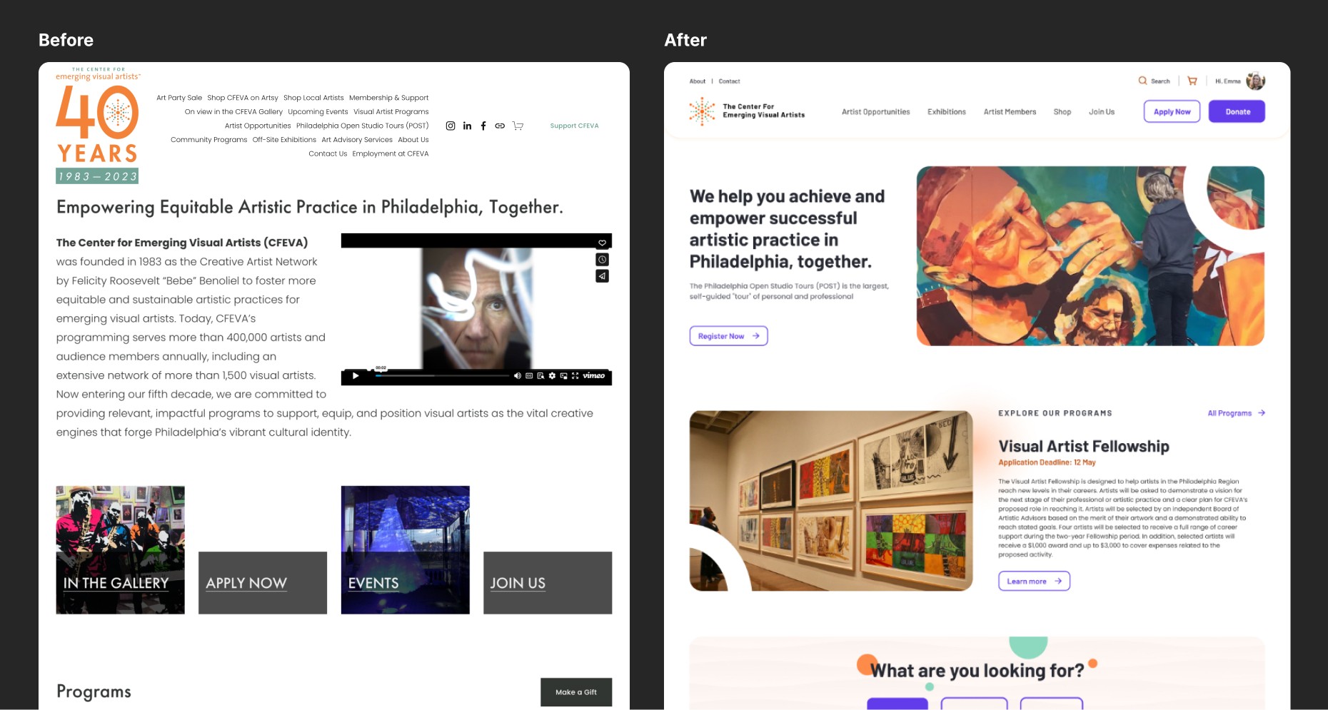
The current website lacks clarity and is difficult to navigate.
Our solution involves a complete redesign of the user journey for artists, donors, and visitors, ensuring clear pathways to their desired engagements with CFEVA.
Revamping navigation by categorizing content based on user segments for easy access and user-friendliness.
Enhancing the user interface by making it engaging and visually appealing, encouraging users to explore CFEVA's offerings.

Design Outcomes
Simplified Navigation
Simplified Navigation
We reorganized the navigation and defined a hub for artist resources. A clear CTA was designed for exhibition and program applications, addressing user needs. We added a distinct CTA for donors, previously overlooked. To tackle ambiguity in program names, we employed visual treatments in the menu.
In summary, our redesign prioritizes clear and user-friendly navigation for seamless exploration.
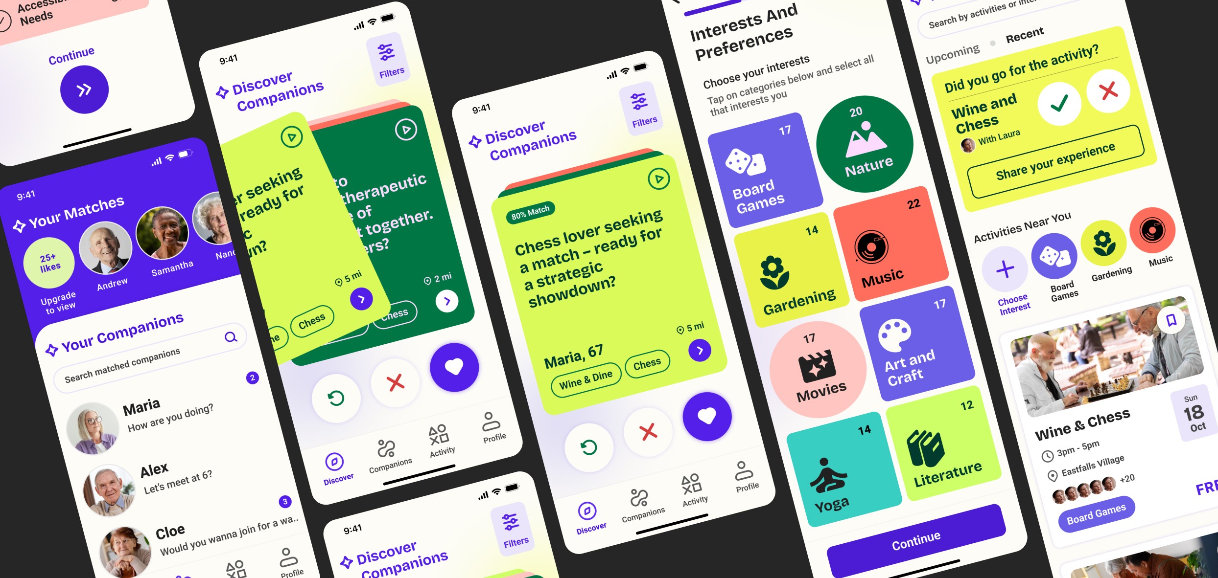
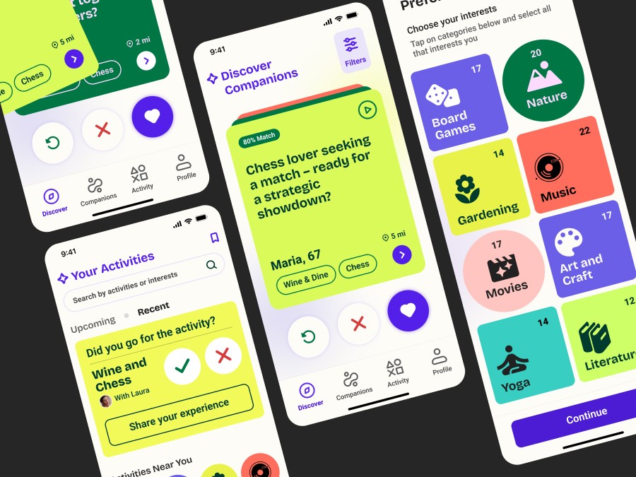
Intuitive Product Finder
Intuitive Product Finder
The website caters to three user segments: Artists, Visitors, and Donors.
To expedite user navigation, we implemented a product finder feature, enabling swift access to relevant information.
This feature garnered positive feedback, resulting in increased user engagement.
The website caters to three user segments: Artists, Visitors, and Donors.
To expedite user navigation, we implemented a product finder feature, enabling swift access to relevant information.
This feature garnered positive feedback, resulting in increased user engagement.
Engaging Opportunities
Engaging Opportunities
We streamlined the data, creating a structured CMS page for program details.
Emphasized on outlining event/program details and facilitating user actions like adding to the calendar, saving, or sharing.
To enhance clarity, we specified how each program would benefit respective user segments.
Facilitated artist connections through the artist directory.
Effortless Exhibition Detail
Effortless Exhibition Detail
Unified all exhibitions with pertinent categorization for enhanced usability.
Implemented filters for Artist, Medium, and Theme to refine search options.
Introduced a Map feature for geographical exhibition discovery and a Calendar view for a broader perspective.
Unified all exhibitions with pertinent categorization for enhanced usability.
Implemented filters for Artist, Medium, and Theme to refine search options.
Introduced a Map feature for geographical exhibition discovery and a Calendar view for a broader perspective.

Results and Impact
Results and Impact
Stakeholders and users found the redesign to be really impactful and visually appealing.
The findability with respect to the artist, donor, and visitor segments was clear and easy.
Users appreciated the membership and event focus, thus increasing engagement.
Stakeholders and users found the redesign to be really impactful and visually appealing.
The findability with respect to the artist, donor, and visitor segments was clear and easy.
Users appreciated the membership and event focus, thus increasing engagement.
32% higher engagement
78% faster performance
55% decrease in cognitive load
43% higher satisfaction
UX Roadmap
UX Roadmap
User
Interviews
5
Stakeholder
Interviews
1
Card
Sorting
5
Tree
Testing
3
Usability
Testing
3
Research and Ideation
Research and Ideation
Interviewed five artists and one stakeholder to understand challenges, needs and goals.
Performed Usability and Tree tests on the existing website for navigation insights.
conducted a content audit to identify redundant links and dead navigation.
Interviewed five artists and one stakeholder to understand challenges, needs and goals.
Performed Usability and Tree tests on the existing website for navigation insights.
conducted a content audit to identify redundant links and dead navigation.

Key Findings
Ambiguity in understanding the top navigation, as it looks more like a paragraph.
The website lacks intuitiveness, leading to user boredom.
Despite the success rate of accomplishing a task, the user is unable to perform it directly.
Perplexing labels, overwhelming content to look.
Takeaways and Insights
Takeaways and Insights
Design an intuitive and user-friendly navigation that has categorized content according to the user profiles.
Design an intuitive and user-friendly navigation that has categorized content according to the user profiles.
Utilize the homepage to promote upcoming events and opportunities that generate engagement.
Utilize the homepage to promote upcoming events and opportunities that generate engagement.
Promote artist profiles that help build the artist community.
Promote artist profiles that help build the artist community.
Strategize to shift the interaction from emails to website interactions to build a smooth process.
Strategize to shift the interaction from emails to website interactions to build a smooth process.
User Persona

Card Sorting


Navigation Flow
Navigation Flow

Service Blueprint
Service Blueprint

Usability Findings on Wireframes
Usability Findings on Wireframes
The navigation is clear and concise. It no longer looks like a paragraph.
Loved the membership cards and upcoming events section.
It's good to see different ways to donate in one glance
The options like quick share, like and add to calendar enhance the user experience
The navigation is clear and concise. It no longer looks like a paragraph.
Loved the membership cards and upcoming events section.
It's good to see different ways to donate in one glance
The options like quick share, like and add to calendar enhance the user experience
Would want to have the ability to view all categories at once.
Including the stall number, medium and refining the filters
Increase in cognitive load due to scrolling through a vast list of categories
Participant Directory to shuffle up as that is important from artist's point of view
Would want to have the ability to view all categories at once.
Including the stall number, medium and refining the filters
Increase in cognitive load due to scrolling through a vast list of categories
Participant Directory to shuffle up as that is important from artist's point of view

Key Takeaways
and Learnings
Key Takeaways
and Learnings
After a year spent researching the problem area, interviewing users and iterating the design, I had the most enjoyable experience during the testing phase with users. The insights I gained from this process were truly mind-blowing.,
Designing the interface for this particular user segment was a challenging and interesting task. The presence of accessibility constraints, and technology constraints, led to a deeper understanding of how to build a user-friendly product for people of all ages, by focusing on the extremes.
Throughout my journey, I have come to realize the importance of empathy and how the solutions we create can impact society in a positive way, enriching their lives. As an opportunity for growth, I have noticed that many adults between the ages of 30 and 50 are also experiencing feelings of loneliness. Therefore, extending a solution like this to a younger segment could be highly beneficial.

Other Projects
Other Projects
That was a lot of scrolling;
wanna hire me?
Now actively seeking new opportunities.
Think I'd be a good fit for your team?
Open to relocate | Hybrid | Remote
That was a lot of scrolling;
wanna hire me?
Now actively seeking new opportunities.
Think I'd be a good fit for your team?
Open to relocate | Hybrid | Remote
That was a lot of scrolling;
wanna hire me?
Now actively seeking new opportunities.
Think I'd be a good fit for your team?
Open to relocate | Hybrid | Remote